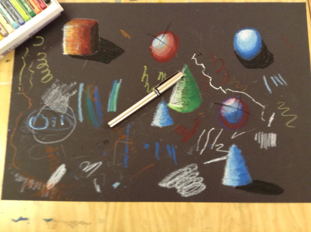
practicing making the shapes
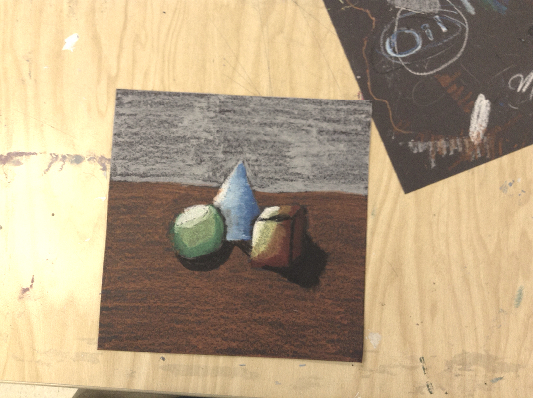
The Final Product
My experience working with pastels was very interesting, because it was somewhat hard not messing up since I knew on the final product it was permenent. I made the value by putting the light colors towards the light source, the darker colors farther away, and making shadows. Overlapping is important because it makes the shawdowing more realistic. If you don't overlap the colors on the shapes will just look like a pattern on shapes. I think I did make a clear but the on the circle it may look a little off. Value is important so your picture doesn't look 2D and it make it look more realistic.
0 Comments
| AuthorWrite something about yourself. No need to be fancy, just an overview. ArchivesCategories |
 RSS Feed