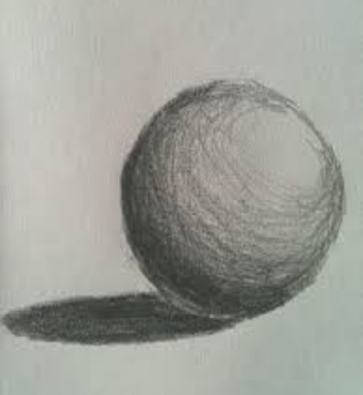
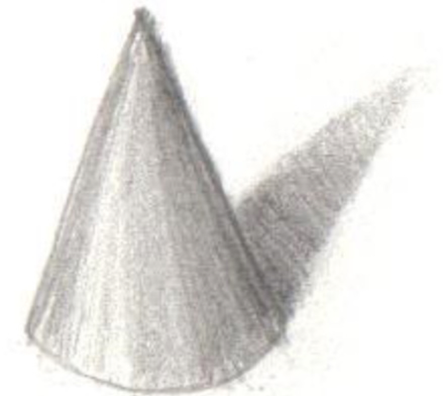
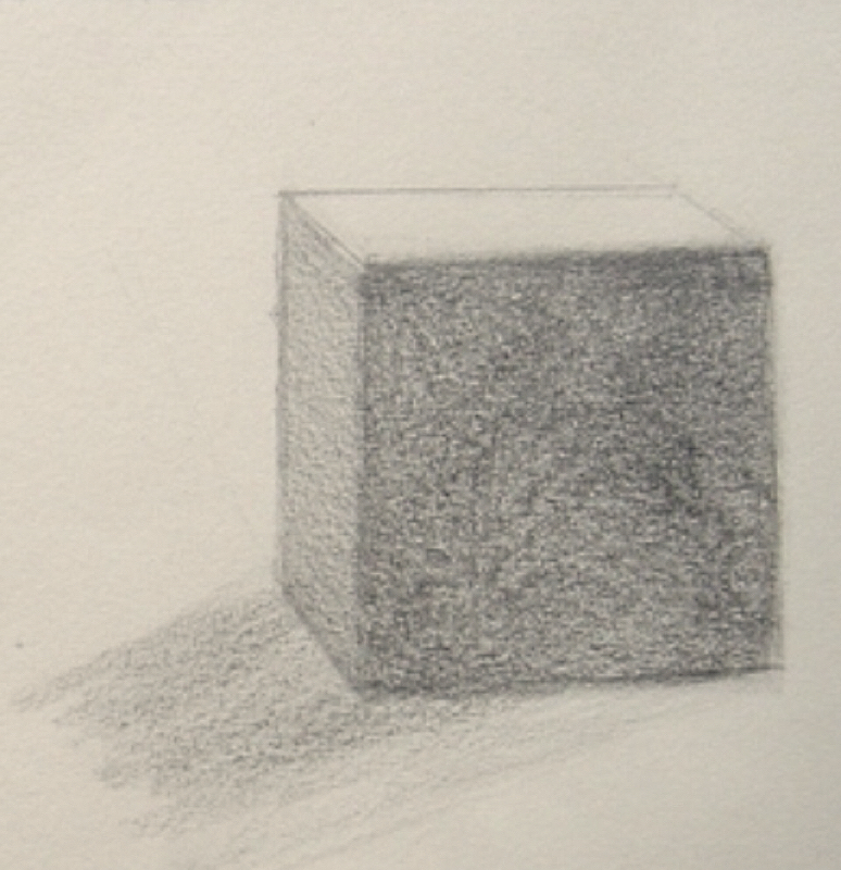
   These are the shapes that I shaded. Sphere, cube, and cones are all 3D shapes so mailing them like 3D on a 2D surface can't be all that easy. Shading can be hard at first but if you practice abit then you can get the hang of it. When I first started to shade these shapes I did encounter some problems. First, keeping the shading realistic, I had to have a single light source so if there was darkness near that it would make no sense. Second, this was minor problem but it was still some trouble that if I got the area to dark it would be too hard to erase that mistake. I took care of problem #1 by making sure I had a set point for a light source then thinking about how it would look like in real life. I solved the second problem by just got lightly at first until I was 100% that darkness goes there.
0 Comments
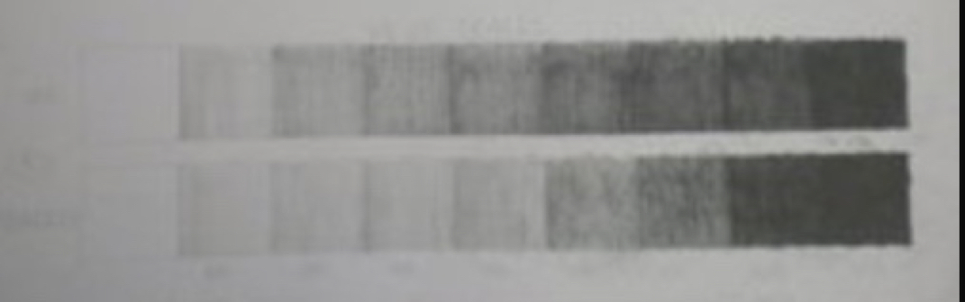
The value chart wasn't to hard but it wasn't easy. The only issue I had was the chart not being perfect. I responded to the problem by just doing my best. I did do something unique by doing the darkest and lightest first then going back and forth till I get in the middle. 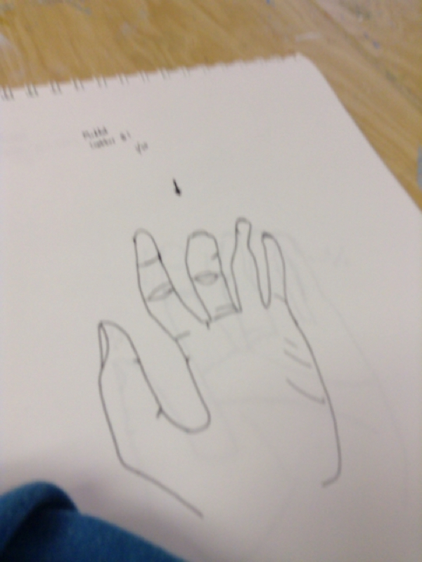
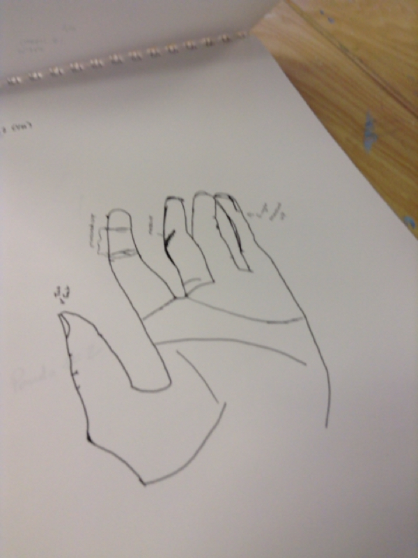
This is my art on the modded contour style, it's pretty messy if you are new to it like me. I did come across a few issues such as drawing with only hand. Drawing with one hand can be hard since you really don't have anything to keep your paper stable but it worked out. My second issues was the fact that I had to draw something realistic which can be hard. I responded to the challenge of one hand drawing by taking it slow. Drawing something realistic was hard but since I was taking it slow I did better than expected. I use some of my own ideas into the drawing by trying to memorize exactly how my hand looked when I looked away to draw so I would be more accurate - Alex Sanchez 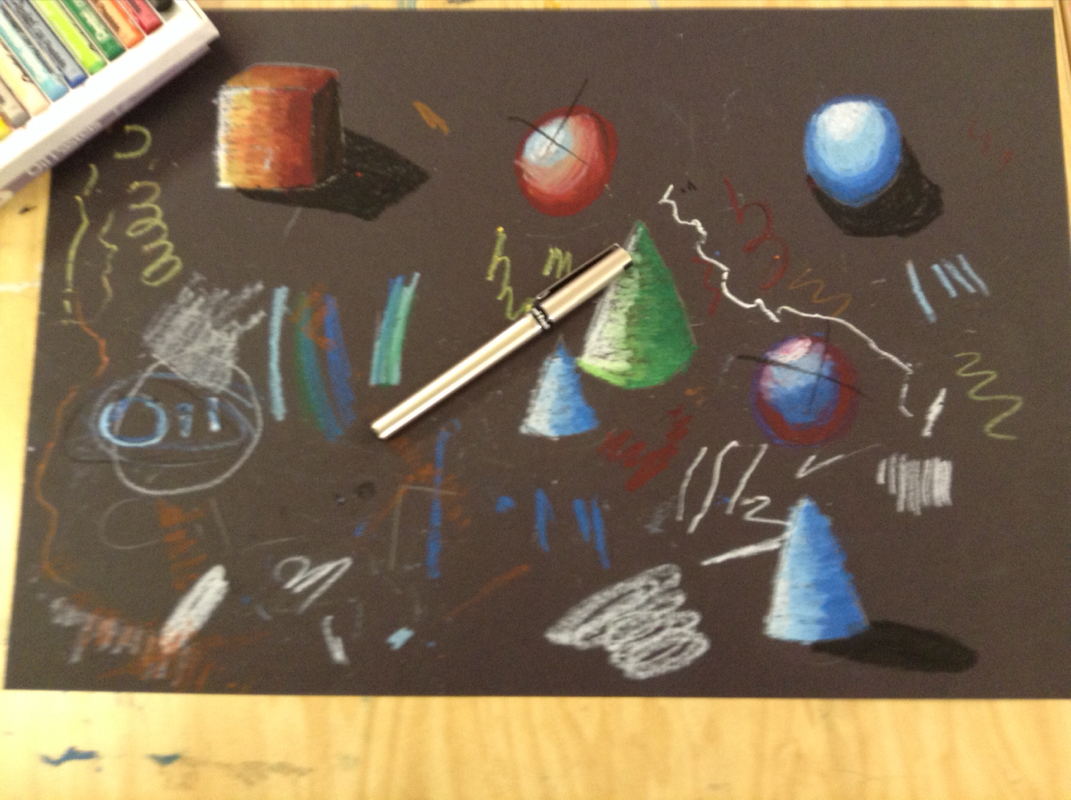
practicing making the shapes
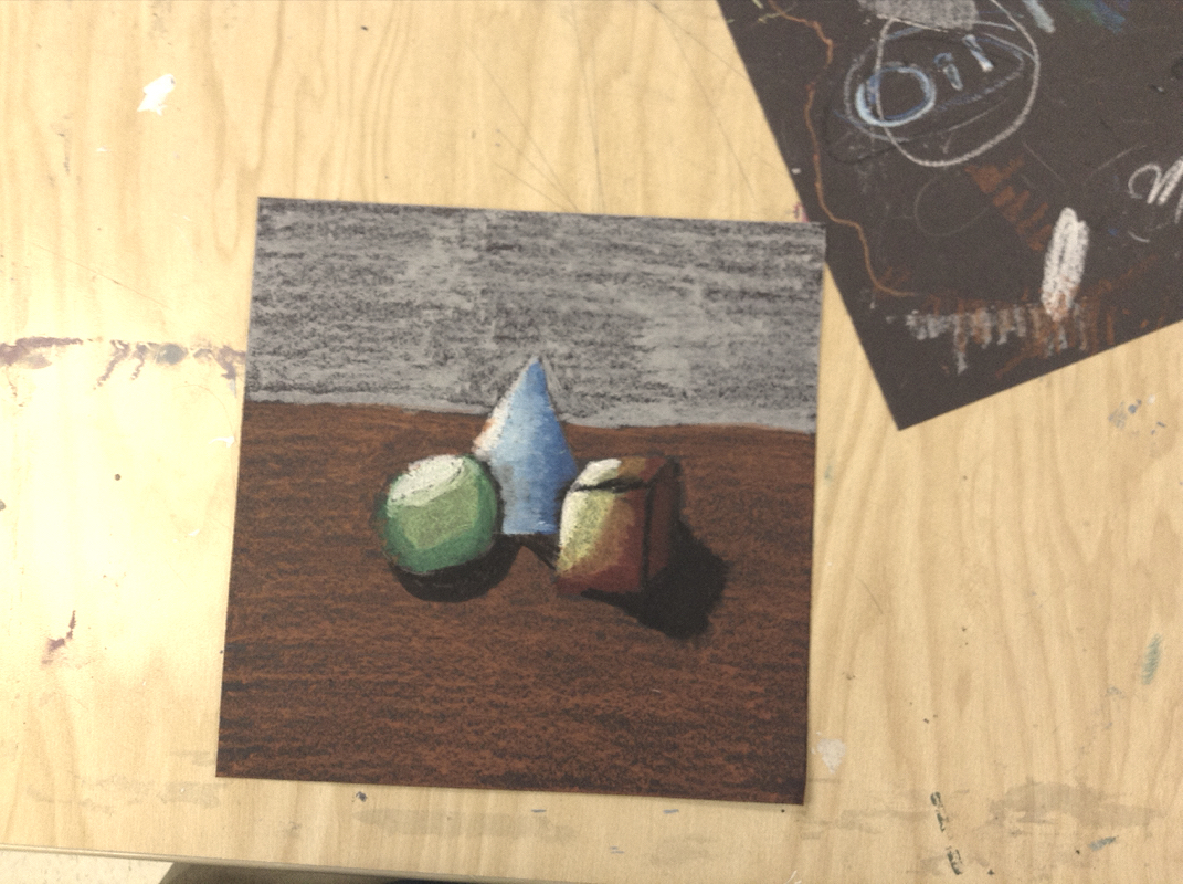
The Final Product
My experience working with pastels was very interesting, because it was somewhat hard not messing up since I knew on the final product it was permenent. I made the value by putting the light colors towards the light source, the darker colors farther away, and making shadows. Overlapping is important because it makes the shawdowing more realistic. If you don't overlap the colors on the shapes will just look like a pattern on shapes. I think I did make a clear but the on the circle it may look a little off. Value is important so your picture doesn't look 2D and it make it look more realistic. | AuthorWrite something about yourself. No need to be fancy, just an overview. ArchivesCategories |
 RSS Feed